

To give the Blackmores Sydney Running Festival 2016, a refreshing new look and feel with an intriguing Key Visual and campaignable visual elements.
I took my previously designed logo and added some colour-coded “ribbons” to the character’s feet as a visual metaphor to the specific course distances. These “ribbons” were then used to contain iconic Sydney structures and aspirational running images to create the Key Visual. This was also adapted to work with the Chinese market as seen in the DPS for China Air.
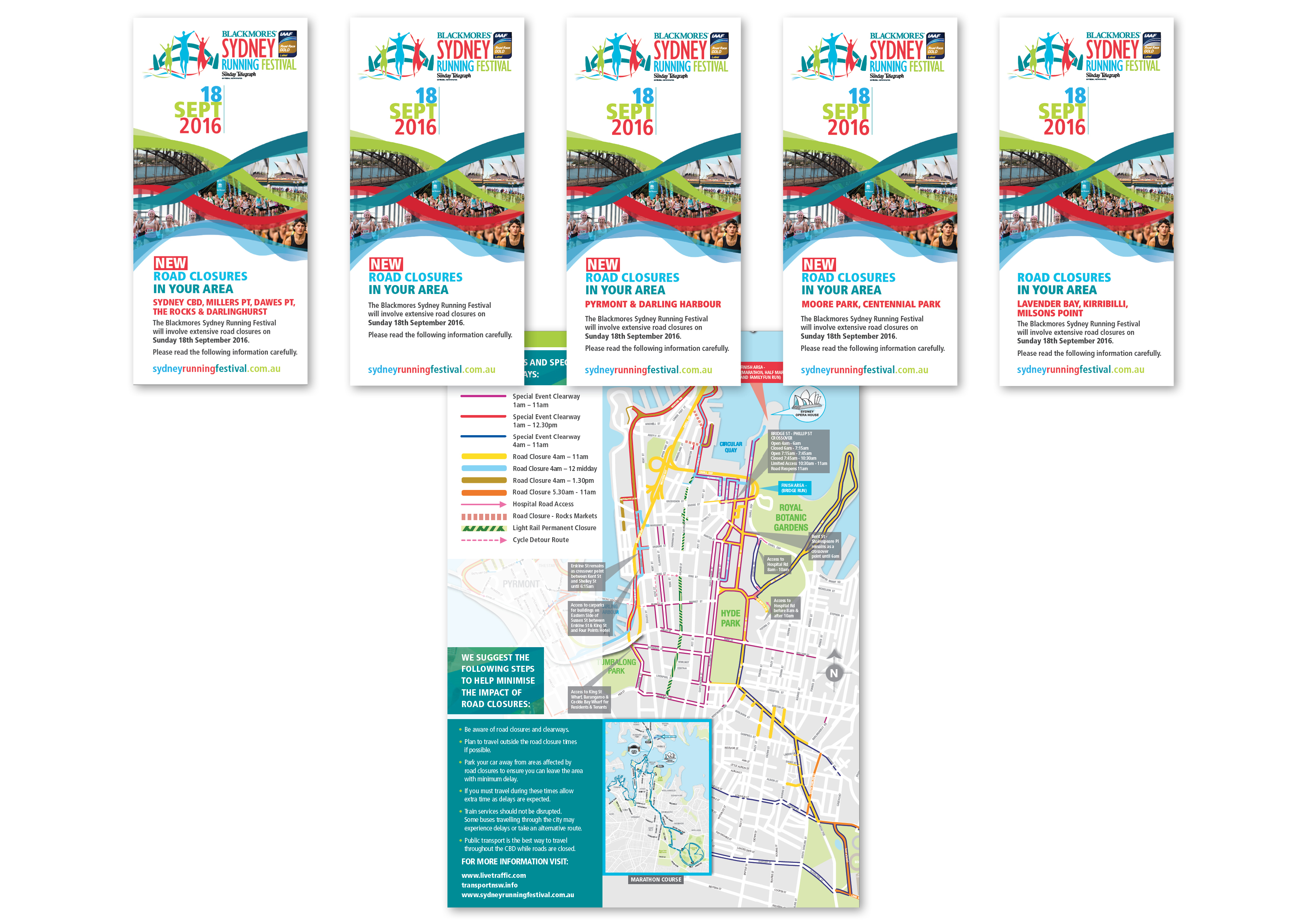
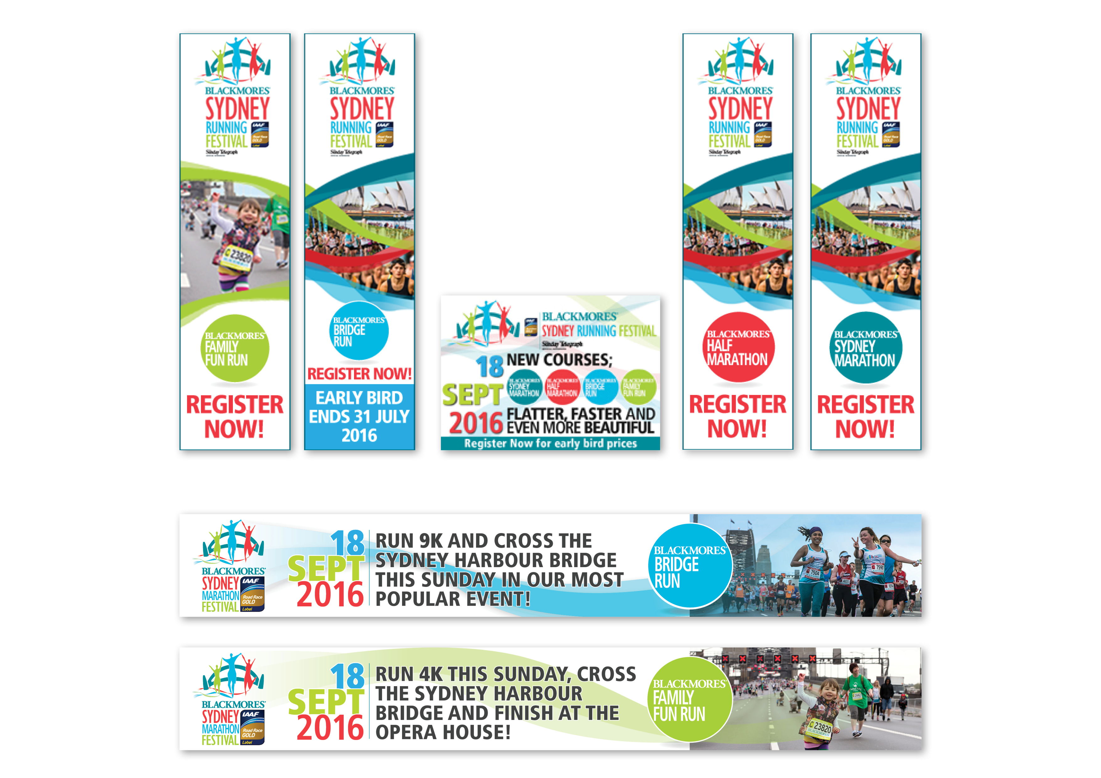
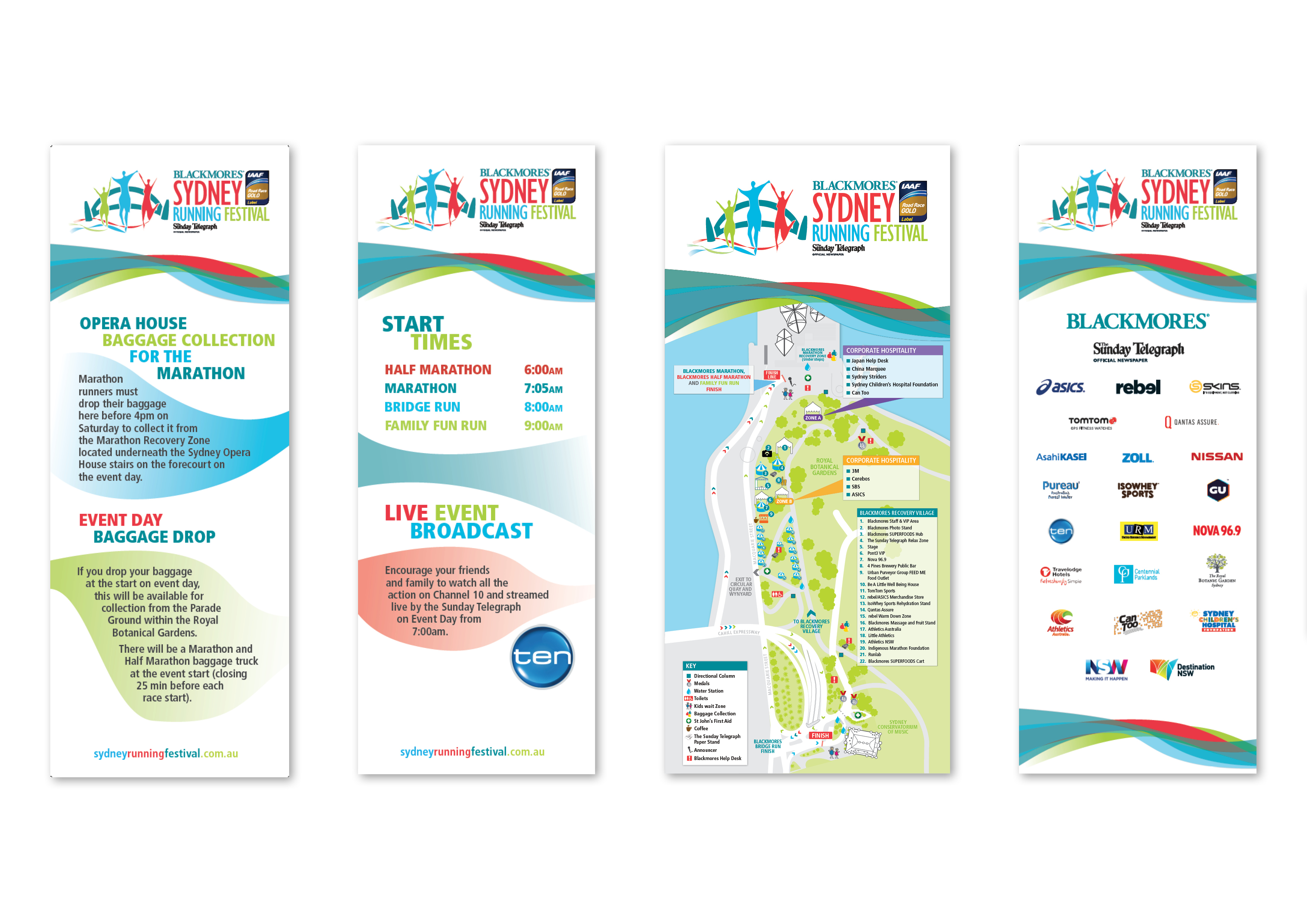
A new logo suite and KV was developed and implemented throughout press and online ads, website, signage, course maps, road closure brochures and all facets of event collateral.
The new look added to this years’ huge success with over 34,000 entrants enjoying the four fast, flat and beautiful courses.


